TODAY’S DATA LENS
Same bars. Better order.
Observation
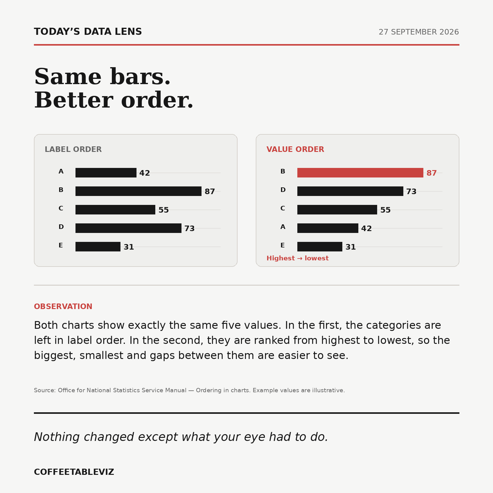
Both charts show exactly the same five values. In the first, the categories are left in label order. In the second, they are ranked from highest to lowest, so the biggest, smallest and gaps between them are easier to see.
Nothing changed except what your eye had to do.