Design
Running in Shapes: A Bauhaus-Inspired Journey Through Data
Three Tableau experiments turn a year of running into geometric figures, playful patterns and a Bauhaus-styled activity log.
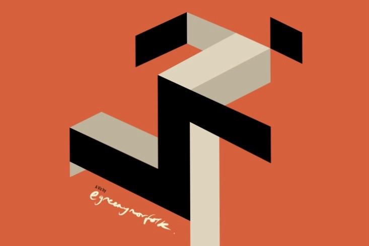
This year I experimented with Bauhaus-inspired designs to visualise my running journey, merging data with a bold artistic style I love. Here is the thought process behind three visuals.
Bauhaus Running Man: miles per month
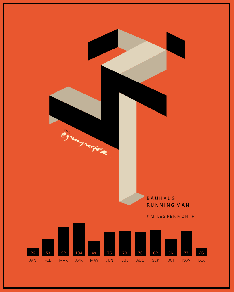
The first visualisation combines geometric abstraction with data, reflecting my monthly mileage in a minimalist format. The bold running figure symbolises motion and progress, while the bar chart below quantifies the journey month by month. March and April stand out as peak months.
Hidden Miles: a playful perspective
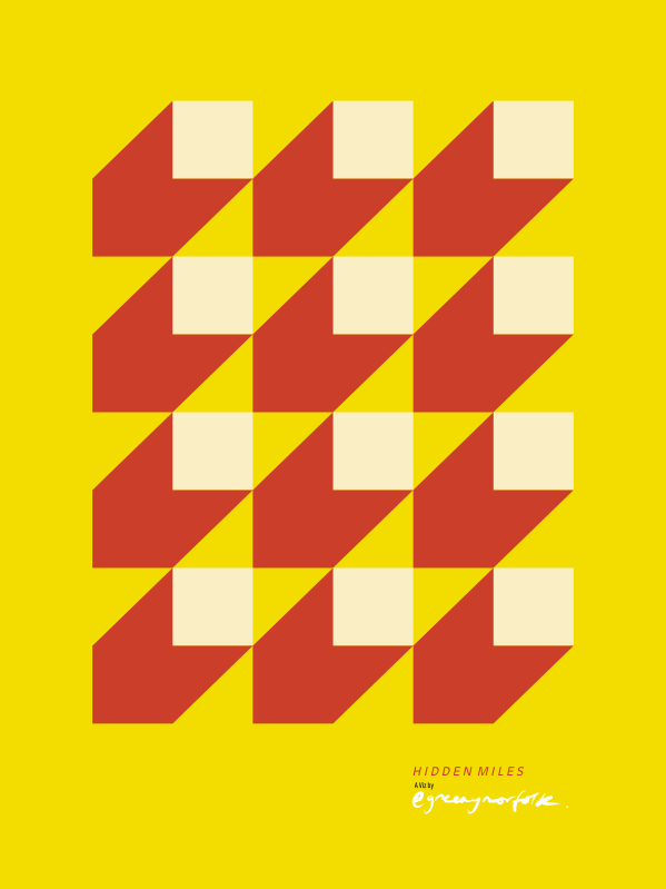
The second piece uses a playful pattern of interlocking shapes. Its yellow, red and cream palette adds vibrancy, while the repeated geometric forms symbolise the repetition and discipline behind every logged mile.
The Bauhaus-styled run log
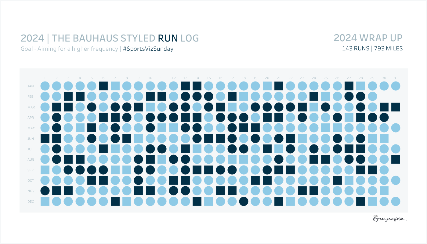
The final visualisation is a heatmap of the full year, showing frequency and consistency — or lack of it — at a glance. Circles mark weekdays, squares mark weekends, dark blue records run activity and muted blue marks days without running.
The Bauhaus influence
Bauhaus design emphasises function, simplicity and the beauty of geometric forms. Applying those ideas to data visualisation created a distinctive way to tell the story of my year, where art and data meet in something both informative and visually striking.
These visuals represent more than numbers; they celebrate creativity, motion and the timeless inspiration of Bauhaus design.
That is me done for 2024. Let’s hope my knees hold out for 2025.
Adam
First published on the original coffeetableviz WordPress site.